
Figma assets for UI, UX & product design.
Explore Figma assets, UI kits, templates, components, web layouts and product-design resources for websites, mobile apps, dashboards and digital interfaces. Build faster design workflows with reusable creative resources from Brushes Pack.
Build interfaces faster with reusable design resources.
From complete UI kits to smaller components and layout templates, Figma resources can help designers move from an empty canvas to a structured interface more efficiently.
Figma UI Kits
Explore coordinated interface elements, screens and components for web and mobile product design.
Explore Figma UI kits →Mobile App UI Kits
Build mobile interfaces with reusable screens, navigation patterns, cards, forms and app components.
Browse mobile UI resources →Figma Website Templates
Create landing pages, business websites, portfolios and other web layouts with editable templates.
Explore web templates →Dashboard UI Kits
Design admin panels, analytics products, SaaS interfaces and data-heavy applications more efficiently.
Browse dashboard kits →Figma Components
Use reusable buttons, cards, navigation patterns and other interface building blocks across projects.
Explore components →Wireframe Kits
Plan page structure, product flows and user journeys before committing to detailed visual styling.
Browse wireframe resources →Design Systems
Create more consistent products with reusable styles, interface patterns and component libraries.
Explore design systems →Figma Mockups
Present interface concepts inside device, browser and product scenes for polished design presentations.
Browse Figma mockups →Product Design Templates
Explore resources for SaaS, ecommerce, startup products and other end-to-end digital experiences.
Explore product templates →Reusable assets can reduce setup time without replacing design thinking.
Good resources give you a structured starting point while leaving room to customize hierarchy, branding, content and user experience around the needs of the product.
Start Faster
Begin with structured layouts instead of rebuilding common interface patterns every time.
Stay Consistent
Reuse components and styles to create stronger visual consistency across screens.
Explore Variations
Compare different layouts and interaction patterns before refining the final interface.
Present Clearly
Use polished templates and mockups to communicate product ideas more effectively.
A strong UI kit is a starting system—not a finished product.
Use prebuilt resources to save repetitive setup work, then adapt typography, spacing, colors, components and content around the real needs of your project.
Check file compatibility
Review the product information to confirm the included files can be opened or imported into your workflow.
Review component structure
Look for reusable elements and organized layouts that can be adapted across multiple screens.
Customize the visual system
Adjust colors, typography and spacing so the resource supports your own product or brand.
Design for users
Templates speed up production, but content hierarchy and usability should still respond to real user needs.
Turn reusable Figma assets into a customized interface.
Start with the right resource, understand its structure and then adapt it around your product rather than treating the original design as the final answer.
Choose
Select a UI kit or template that matches your platform, product type and required screens.
Review
Understand the components, layouts, typography and overall structure before editing.
Customize
Apply your own branding, content, spacing and interface hierarchy.
Prototype
Connect important screens and test how users move through the experience.
Refine
Review consistency, usability and responsive behavior before handoff or production.
Explore Figma resources by interface type and design workflow.
Find reusable assets for websites, mobile apps, SaaS products, dashboards and digital-product interfaces.
New Figma assets.
Explore recently added Figma resources. This section automatically updates whenever new products are published in the Figma category.
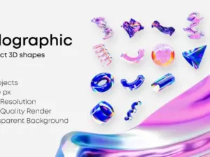
Abstract 3D shapes Figma Template
Sold by

3D Business Woman Character
Sold by SlabDsgn

Figma asset questions.
Helpful information about using UI kits, templates, components and product-design resources in Figma workflows.
What are Figma assets?
Figma assets are reusable design resources such as UI kits, templates, components, layouts, mockups and interface elements that can support digital-product workflows.
What is a Figma UI kit?
A UI kit is a collection of interface elements and screens that can help designers create websites, mobile apps or other digital products more efficiently.
Can I customize Figma templates?
Templates are generally intended to provide a starting structure. Review each product page for its included files and specific details before use.
Are Figma assets useful for beginners?
Yes. Well-organized UI kits can help beginners study spacing, hierarchy, components and common interface patterns while learning Figma.
What can I design with Figma templates?
Resources can support websites, mobile apps, dashboards, SaaS products, landing pages and many other interface-design projects.
What are reusable Figma components?
Components are interface elements designed for reuse. Examples include buttons, cards, navigation, form controls and other repeated patterns.
Should I use a template without changing it?
Usually not. Customize visual style, hierarchy and content so the final design reflects the requirements of your own product.
Where can I get help with my download?
Visit Contact Us or review the Brushes Pack FAQ’s.
Figma assets and UI design resources for digital products.
Figma assets can help designers move more efficiently from early concepts to polished digital interfaces. Reusable templates, components and UI kits reduce repetitive setup work while providing a structured foundation for websites, mobile apps, SaaS products and other digital experiences.
At Brushes Pack, designers can explore Figma assets, interface resources and other digital design tools alongside a wider marketplace of creative assets.
Figma UI kits
Figma UI kits contain interface elements and screens designed around a particular product type or visual system. A kit may include navigation, cards, buttons, forms, profiles, dashboards and other recurring interface patterns.
Instead of rebuilding each element from the beginning, designers can adapt these resources to fit the needs of their own products.
Figma templates
Templates provide a pre-designed starting structure for websites, landing pages, apps and other interfaces. They can be especially helpful during early concept work when you want to explore layout directions quickly.
The strongest results come from treating templates as flexible foundations rather than finished designs.
Figma website templates
Website templates can support homepages, landing pages, portfolios, ecommerce layouts, corporate websites and other web-design projects.
Adapt the structure around your own content hierarchy, branding and conversion goals rather than simply changing colors and text.
Figma mobile UI kits
Mobile UI kits provide reusable screens and interface elements for smartphone applications. They can include onboarding, login screens, profiles, menus, product listings, checkout flows and other common patterns.
When customizing mobile layouts, maintain clear spacing, readable typography and touch-friendly controls.
Dashboard UI kits
Dashboard resources are useful for analytics tools, administrative products, SaaS platforms and data-heavy interfaces.
Charts and tables may attract attention, but information hierarchy is critical. Important metrics and actions should remain easy to locate.
Figma components
Components allow recurring interface elements to be reused consistently. Buttons, cards, navigation, alerts and form controls are common examples.
Reusable components can make large projects easier to maintain because updates can be applied more systematically across the interface.
Figma design systems
A design system extends beyond individual components by defining the visual and interaction rules that connect them. It may include color styles, typography, spacing, components and usage patterns.
Starting with a structured system can improve consistency, especially when many screens or designers are involved in the same product.
Figma wireframe kits
Wireframes focus on structure rather than detailed visual design. They are useful for planning navigation, page hierarchy, user flows and screen relationships before investing time in polished styling.
A reusable wireframe kit can make early product exploration considerably faster.
UI design resources
UI design resources can include layouts, buttons, form elements, cards, navigation and other visual patterns used to create interfaces.
The goal is not simply to assemble attractive components. Each resource should support clear communication and usable interactions.
UX design templates
UX-focused resources can help designers map flows and structure product experiences. Templates may support journey mapping, wireframing or screen planning depending on the product.
Use them to organize thinking, but validate important assumptions through real user research and testing whenever possible.
Figma resources for SaaS products
SaaS interfaces commonly require dashboards, account settings, billing, navigation, tables and workflow controls. A focused SaaS UI kit can provide many of these patterns within one consistent system.
Customize the structure around the complexity and priorities of the actual application.
Figma resources for ecommerce
Ecommerce interface resources can support product listings, category pages, product detail screens, carts, checkout and account areas.
Strong ecommerce design should keep product discovery and purchasing actions clear rather than allowing decorative interface elements to dominate the experience.
Figma mockups
Mockups help present interface work in a more realistic context. Device or browser scenes can be useful when sharing a concept with clients, stakeholders or portfolio viewers.
For additional presentation resources, explore Mockup Templates.
Figma assets for landing pages
Landing-page resources can help structure hero areas, social proof, feature sections, pricing blocks and calls to action.
Use the existing design as a framework, then adapt content order around the specific audience and conversion objective of your project.
Figma assets for mobile apps
Mobile app resources are useful when prototyping flows such as onboarding, search, profile management, content browsing and checkout.
Reusable screen patterns make it easier to explore several product directions before investing in a complete visual system.
How to choose a Figma UI kit
Start with project fit. A kit designed for an analytics platform may not be the right starting point for a portfolio or ecommerce experience.
Then review the number and type of screens, visual style, component organization and overall flexibility before choosing a resource.
How to customize Figma templates
Begin by replacing typography, color and branding. Then review spacing, page hierarchy, component behavior and content structure.
Avoid stopping after superficial changes. The final product should respond to your own users and goals rather than remaining a lightly modified version of the original template.
How to organize Figma resources
Separate resources by project type, such as Mobile UI, Web UI, Dashboards, Wireframes and Design Systems. You can also maintain a favorites collection for components you frequently use.
Clear organization makes a larger design library easier to navigate during active project work.
Figma assets and design templates
Figma-specific resources can work alongside broader creative templates. Visit Design Templates to explore additional layout resources.
Figma assets and mockups
Once an interface is complete, mockups can help communicate how the design might appear on a real device or within a browser environment.
Browse Mockup Templates for additional presentation options.
Build a broader digital asset library
Product designers may also need icons, templates, graphic elements and other supporting resources outside Figma itself.
Explore Digital Asset Bundles for larger creative collections or visit the Brushes Pack Shop for the complete marketplace.
Download Figma assets from Brushes Pack
Browse the Figma collection at Brushes Pack for interface and product-design resources that can support web, mobile and digital-product workflows.
Before purchasing or downloading, review the individual product page for included files, compatibility details and any specific requirements.
How designers can approach reusable Figma resources.
Editorial-style examples representing common priorities when working with UI kits, components and templates.
“I use UI kits to avoid spending time rebuilding common interface elements, but I always rework the hierarchy and visual system around the actual product.”
“The most useful Figma resources are organized well. Clear components and predictable layers make customization much faster than a beautiful file that is difficult to edit.”
“I treat templates as research material as much as production tools. Comparing several layouts helps me understand which patterns make the most sense for the problem.”
Helpful information before you download.
Learn more about Brushes Pack, access support resources and review important site policies.
Product Design Notes are editorial-style examples representing common creative viewpoints and are not presented as verified purchase testimonials.
Continue building your product-design resource library.
Combine Figma templates with mockups, textures and other creative assets when your project requires broader visual resources.
Build better interface workflows with Figma design resources.
Explore Figma UI kits, templates, components, web layouts and product-design assets for websites, apps, dashboards and digital experiences at Brushes Pack.