

Responsive Tools is your go-to toolkit for creating adaptive and responsive designs effortlessly. With this powerful asset, you can streamline your workflow and ensure that your compositions look stunning across all devices. Say goodbye to tedious adjustments and hello to a more efficient design process!
Product Overview
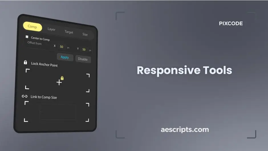
Responsive Tools is a comprehensive suite designed for UI/UX designers and web developers who want to create responsive layouts with ease. This innovative toolkit simplifies the process of making objects and compositions adaptive, allowing you to focus on creativity rather than technicalities.
Key Features & Benefits
- ✅ Four Auto-Adapting Modes → Choose from Comp, Layer, Target, and Size modes to suit your specific design needs.
- ✅ Lock Anchor Points at Nine Positions → Maintain precise control over your layout with flexible anchor points.
- ✅ Layer Locking to Eight Composition Points → Ensure your designs remain responsive without the hassle of extra layers.
- ✅ Non-Destructive Editing → Make adjustments without affecting existing animations, preserving your creative flow.
- ✅ Instant Download → Get started right away with immediate access to your toolkit.
Why Choose This Asset
Responsive Tools stands out among other responsive design tools due to its user-friendly interface and powerful features. You can create professional-grade responsive designs without the steep learning curve. This toolkit is trusted by designers worldwide for its proven effectiveness and reliability.
Specifications
| Compatible with | Software |
|---|---|
| File Type | ZIP |
| File Size | 1.8 MB |
| Instant Download | Yes |
Perfect For
- UI/UX Designers
- Web Developers
- Graphic Designers
- Motion Graphics Artists
- Anyone looking to optimize their responsive design workflow
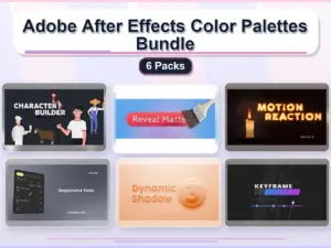
Adobe After Effects Color Palettes Bundle – 6 Packs
Sold by


Original price was: $14.80.$7.40Current price is: $7.40.





There are no reviews yet.